AA Insurance Website
Driving a +50% uplift in car insurance conversions and +35% growth in membership through data-led UX design and a structured CRO programme.

Project Overview
The Challenge
The AA is one of Ireland's most trusted and recognised brands a household name with over a century of heritage in roadside assistance, now operating a broad portfolio of insurance, membership and financial services for Irish consumers. Despite its strong brand equity, theaa.ie was underperforming against its commercial potential.
The website had grown incrementally over many years, resulting in a user experience that served the business's internal structure rather than the mental models and journeys of its customers. The navigation architecture blurred the distinction between the AA's two very different user groups people browsing for the first time who needed to understand products and get a quote, and existing customers who needed to manage their policies and access services.
The core brief was clear: increase online sales of Car Insurance and Membership services by refining digital user journeys and enhancing the overall customer experience to drive higher conversion rates. The approach needed to be data-led, measurable, and capable of delivering continuous improvement rather than a single one-off redesign.
The Approach
01. LAB+ | Persona & Data Analysis
The engagement opened with a deep analytical phase. Existing analytics data was audited to build a granular picture of how different user segments were arriving at theaa.ie, what they were looking for, and where the experience was losing them. Session recording analysis using Hotjar provided qualitative colour to the quantitative funnel data revealing patterns of user frustration that numbers alone couldn't surface.
A persona development process was conducted in close collaboration with the AA's marketing and product teams. This work moved beyond broad demographic segmentation to identify distinct behavioural personas with different motivations, decision-making processes, and digital confidence levels. Critically, this included the AA's large base of existing members a group with fundamentally different needs from first-time visitors, but one who had historically been underserved by a homepage designed primarily for acquisition.
The research crystallised a key insight that became the strategic foundation for the entire redesign: the homepage was trying to serve two completely different audiences simultaneously and serving neither well. Browsing prospects needed inspiration, product clarity, and a low-friction path to a quote. Existing customers needed immediate access to their accounts and self-service tools. These were not competing needs but they required distinct user journeys from the same entry point.
02. CRAFT | Customer Journey Design
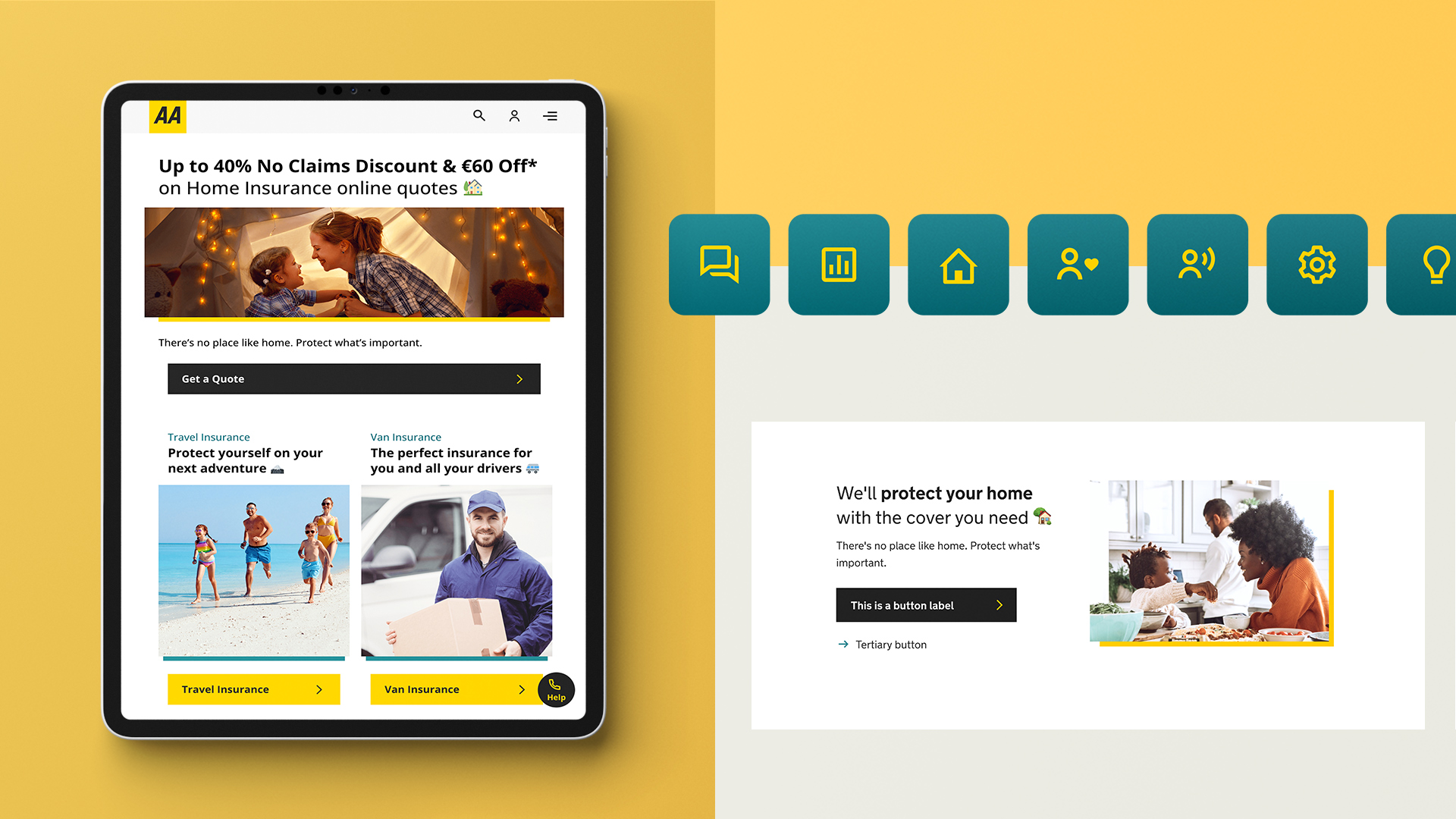
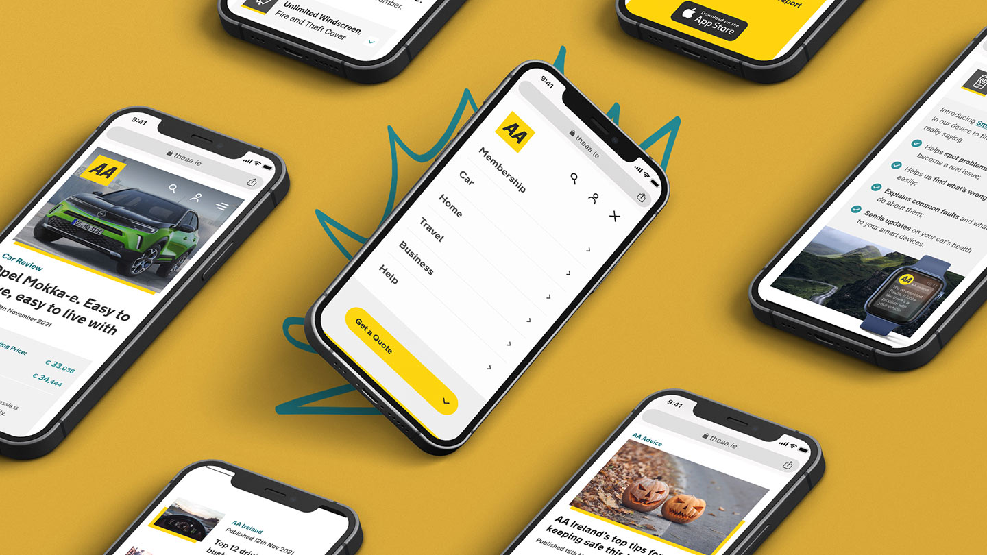
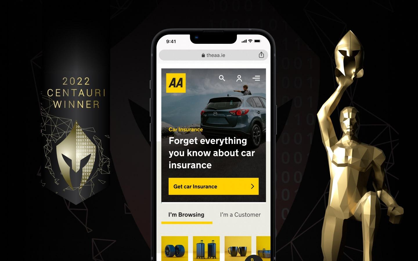
The design response was built around a dual-audience homepage architecture introducing a clear 'I'm Browsing / I'm a Customer' toggle as the primary homepage orientation. This simple structural decision allowed the entire content hierarchy to be tailored to each user's context from the moment they arrived, dramatically reducing cognitive load for both groups and making the most relevant information immediately accessible.
The car insurance quote journey was redesigned end-to-end with conversion as the primary metric. The existing multi-step form was rearchitected to reduce perceived complexity, with each step broken into smaller, more manageable interactions. Progressive disclosure was applied throughout surfacing only the information needed at each decision point, rather than presenting all complexity upfront.
AI-powered personalisation was integrated into the customer journey design using behavioural signals to adapt content recommendations and product sequencing to individual user contexts. This allowed the site to serve more relevant experiences across the membership, travel, home and business product lines without requiring users to explicitly navigate to them.
A new mobile-first design system was built to support the redesign one that codified the AA's distinctive yellow and black brand language into a consistent, scalable set of components. With the majority of theaa.ie sessions coming from mobile devices, the design system prioritised touch interactions, thumb-friendly navigation, and fast-loading visual components.
03. BUILD | CRO Test & Adapt Programme
Unlike a traditional design project that ends at handoff, the AA engagement was structured as a continuous CRO programme with an ongoing cycle of hypothesis formation, test design, live experimentation, and performance-led iteration. This approach ensured that the design improvements were validated by real user behaviour, not assumptions.
A CRO hypothesis framework was developed to prioritise test opportunities based on expected impact, implementation effort, and confidence level. This framework aligned the product, design and development teams around a shared roadmap ensuring that every test was grounded in evidence and that learnings from each experiment fed directly into the next iteration.
A/B and multivariate tests were run across the quote funnel, homepage, product landing pages and navigation with each test designed to answer a specific question about user behaviour. The programme generated a compounding effect: each validated improvement built on the last, creating an optimisation flywheel that continued to generate conversion gains throughout the engagement.
Results
+50%
Car Insurance Conversions
+35%
AA Membership Growth
3×
Industry Awards
The programme delivered transformational commercial results — a 50% increase in car insurance conversions and a 35% uplift in AA Membership sign-ups, both directly attributable to the redesigned user journeys and the CRO programme. These are not incremental improvements; they represent a fundamental shift in the commercial performance of the digital channel.
The work was recognised internationally across three industry award programmes:
- Vega Digital Awards 2022 — Centauri Winner, Best Insurance Website
- Vega Digital Awards 2023 — Gold Winner
- Digital Media Awards 2022 — Finalist, Best Website
Reflection
The AA Ireland project is one of the clearest examples in my portfolio of what happens when user research, design rigour, and commercial discipline work together. The 50% conversion improvement didn't come from a single design intervention it came from a systematic programme of research, hypothesis, experimentation and iteration that compounded over time.
The dual-audience homepage architecture was the most significant structural decision of the project, and it came directly from the research. The insight that existing customers and new prospects had fundamentally different needs and were being equally poorly served by the same homepage was hiding in the data all along. It simply needed a structured research process to surface it.
The CRO programme model proved its value not just in the results it generated, but in the organisational change it enabled. By the end of the engagement, the AA's internal team had a shared language for talking about conversion optimisation, a structured process for generating and prioritising test ideas, and a culture of evidence-based decision-making that continues to shape how they approach digital improvements today.
Gallery
.jpg)